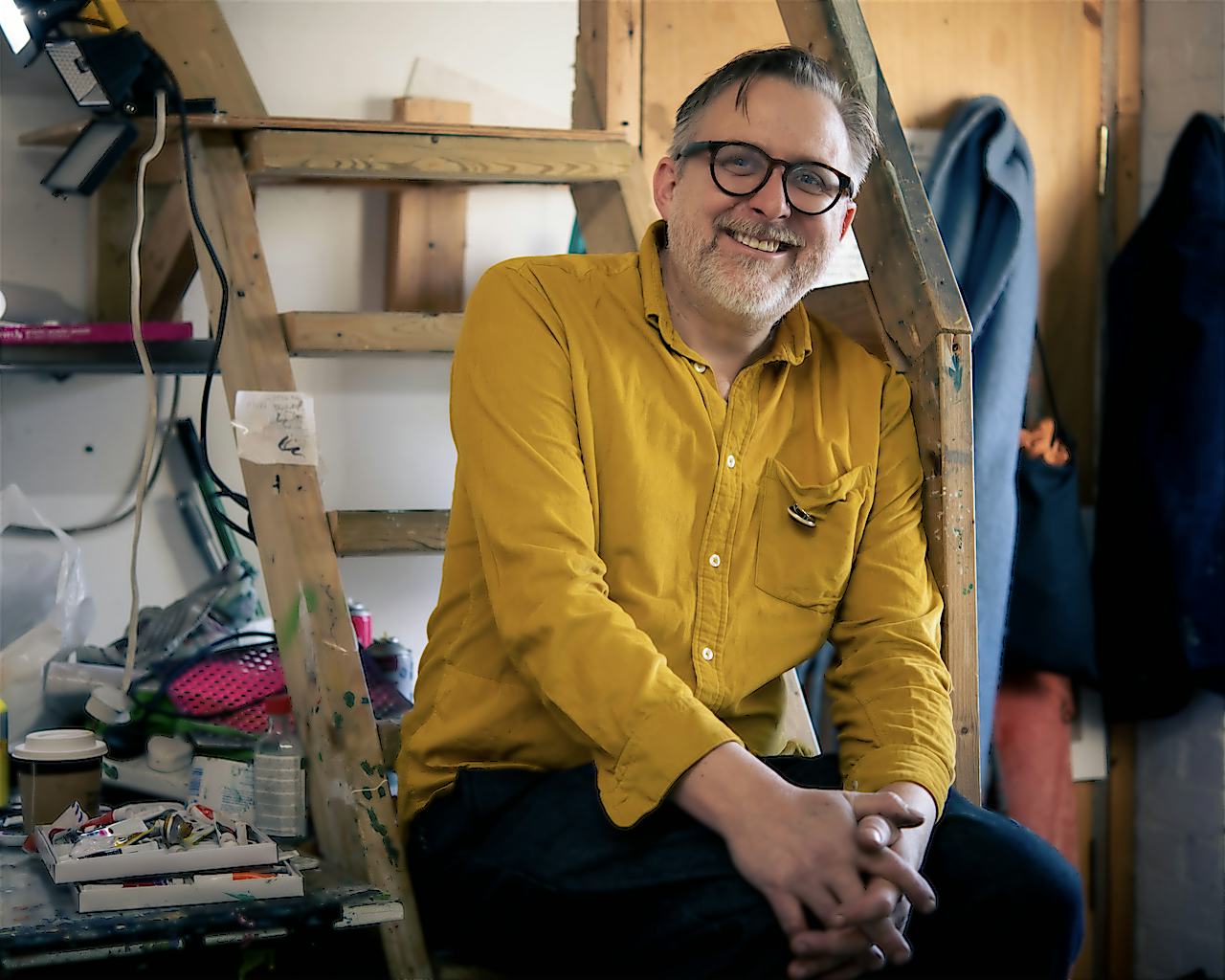
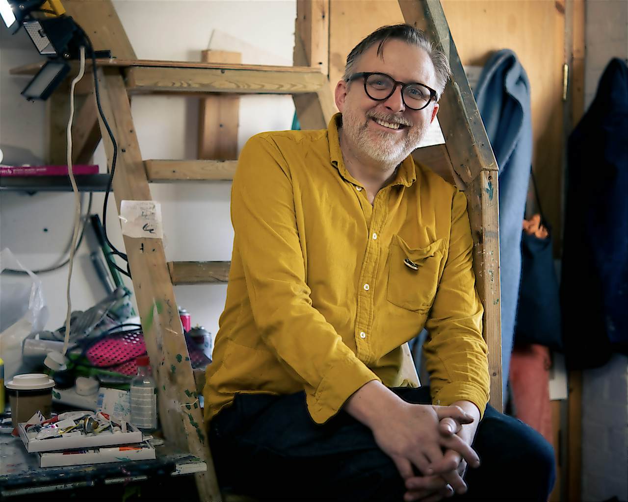
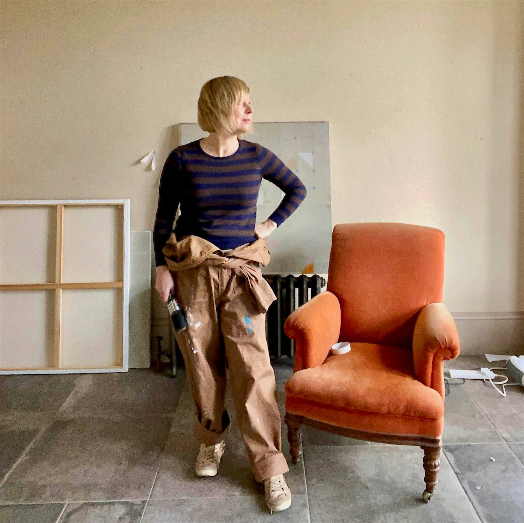
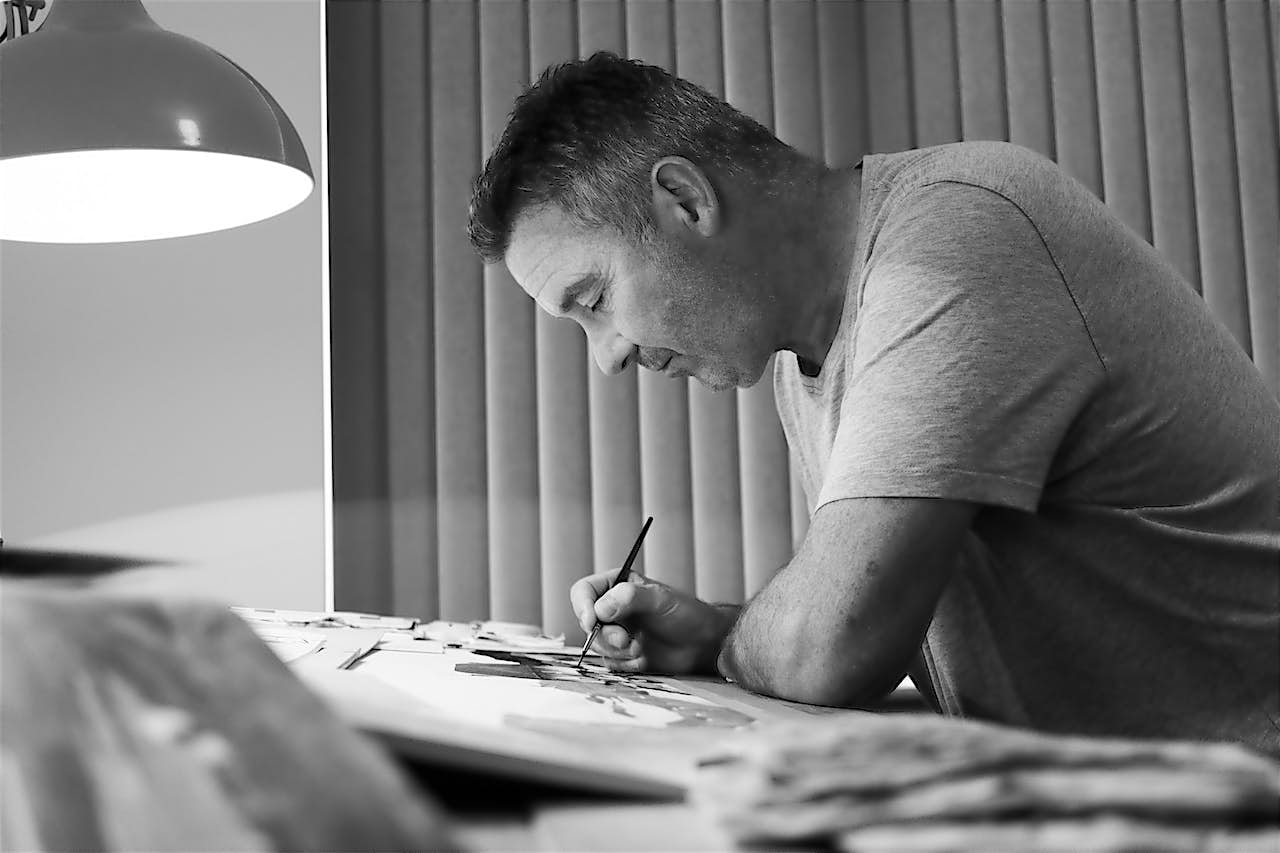
Meet painter and printmaker David Price
Reading time: 4 mins
David Price, a self-confessed aquatint aficionado, originally studied printmaking at the Royal College of Art. He talks to curator Becca Pelly-Fry about his fascination with Dutch still life painting, memento mori, and his enduring love of brash, colourful ‘non-art’.
Q: Hi David, can you tell us about your relationship with printmaking and paper?
A: I’m not really a very good printmaker. I’m not. I’m quite good at some things like print, but printmaking is a really complicated, technical business. I went to Royal College of Art and did printmaking for three years and after that I was a Fellow at the Royal Academy for three years, so you’d think I’d be a very good print maker. Back then, I was really only focusing on etching. I can aquatint like nobody else!
It’s not really the kind of printmaking I’m interested in anymore. Now, I teach a lot of silkscreen and you need to develop these skills for a long time to get them right. As an artist, I’m always making new things and I’m impatient.
Working with paper is a relatively new thing, but it came out of a frustration in my own ability, the facilities around me (during the pandemic, I worked from home), and a desire to make something big, colourful, and bold. Most recently, I’ve been making collage to try and think about how a painting might develop and how the two can come together.

Q: A lot of your work seems to be inspired by still life, can you tell us more about how you choose your subject matter?
A: I’ve been searching around for subject matter that isn’t really about narrative. I want implied narrative. The nice thing about still life, particularly Dutch still life, is that it’s a sort of painting of nothing. At first glance, it’s nothingness. It’s just flowers. It’s just pretty.
But often those paintings are memento mori with symbolic elements: such as a broken glass, fruit that’s on the turn, or flowers that are starting to wilt. Or even something more obvious like a skull. I like the idea that something can be – at first glance – just nothing at all, and have no narrative and have no real meaning.
As a subject matter for an artist, that’s an exciting space, because you can start up without any kind of literal idea about what you want to do. It’s all about visual ideas, visual combinations, visual textures, visual colours, visual things.
On another level, I’m intrigued by this idea of my paintings being about everything: about life and death, the transience of life, about life moving on. All my flower paintings have an element of sadness. Flowers themselves, generally speaking, occupy both worlds because they’re things you can have at a wedding but also things you can have at a funeral on a wreath. They’re bittersweet.

Q: So the natural world is a big influence on your work?
A: More recently, I’ve been interested in still lifes that include nature. We’re all very worried about nature. I’m very worried about nature. Everyone’s worried about nature. And I’m intrigued by the idea that you might commission a painting that was full of dead animals.
I think it’s an interesting moment in recent human history where you would go out hunting, shoot and kill everything, and then paint it. I’m intrigued by that. That kind of arrogance and opulence.
That’s why I really like Dutch still life paintings but I’m not really interested in it as a historian. Dutch still life represents a kind of excellence of paintings and I use that as a starting point. I’m more interested in modern artists like David Hockney, Melanie Daniel, Daniel Richter, or Sarah Hughes – people who are engaged in similar subject matter and colours to me.
‘I quite like exploring these things which have a brash, almost cheap, almost ‘non art’ thing [...] I like the surprise of throwing things together.’
David Price

Q: Your colours are quite fantastical. Can you tell us more about that?
A: I think it’s probably because I had quite a traditional art college education. I read and taught a lot about colour theory; how the Impressionists chose colour, and how colours contrast one another, colour wheels and so on.
But, I quite like to surprise myself. People are kind of funny about colour theory and they don’t use fluorescent paint. They’re quite a recent invention. But the fluorescent itself isn’t reasoned.
I like exploring things that have a brash, almost cheap, ‘non art’ thing in defiance of that kind of snobbery. I like the brightness and the putting together of ‘wrong’ things to get a jarring outcome. I just want to put fluorescent green next to purple and see what happens. I want them to be ugly or slightly uncomfortable together.
‘I love that reveal in the moment of a print: when you put an etching through and you peel the paper back, that’s a real moment of magic.’
David Price
Q: Is there an element of chance and accident with your work?
A: Yeah, I think more recently (possibly, as a consequence of a lack of materials), I’ve begun chopping up my own work and then reusing it. And it’s sort of an economy. But I like what happens. You end up getting all the things that weren't supposed to be together and in a ‘new togetherness’. You get these funny edges of things and random bits of colour, a palimpsest, a layering of things.
I like to invite an element of chance and printmaking is often about processes that have an element of chance. Good printmakers try to limit that and reproduce things perfectly. But, if you’re like me, and you’re not particularly good at printmaking, you’re just an enthusiastic printmaker, then there’s always an element of chance.
I love that reveal in the moment of a print: when you put an etching through and you peel the paper back, that reveal is a moment of magic.

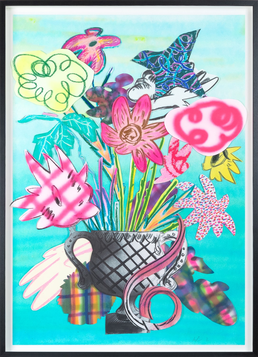
Q: Can you tell us about the Curated Editions, New Mythologies print you’ve made with King & McGaw?
A: The print is the result of an experimental practice of drawing, cutting and arranging compositional elements that I developed during lockdown. It’s named after the 1925 E. E. Cummings’ poem, Spring Is Like A Perhaps Hand.
It combines various types of processes including screen-printing, high-definition photography, digital reproduction, and hand-made elements I created in my studio. I’ve also signed and numbered all 25 of the limited editions and, as none of the hand-made elements in the prints are quite the same, each individual edition is subtly different and unique.


Related stories
 spotlight
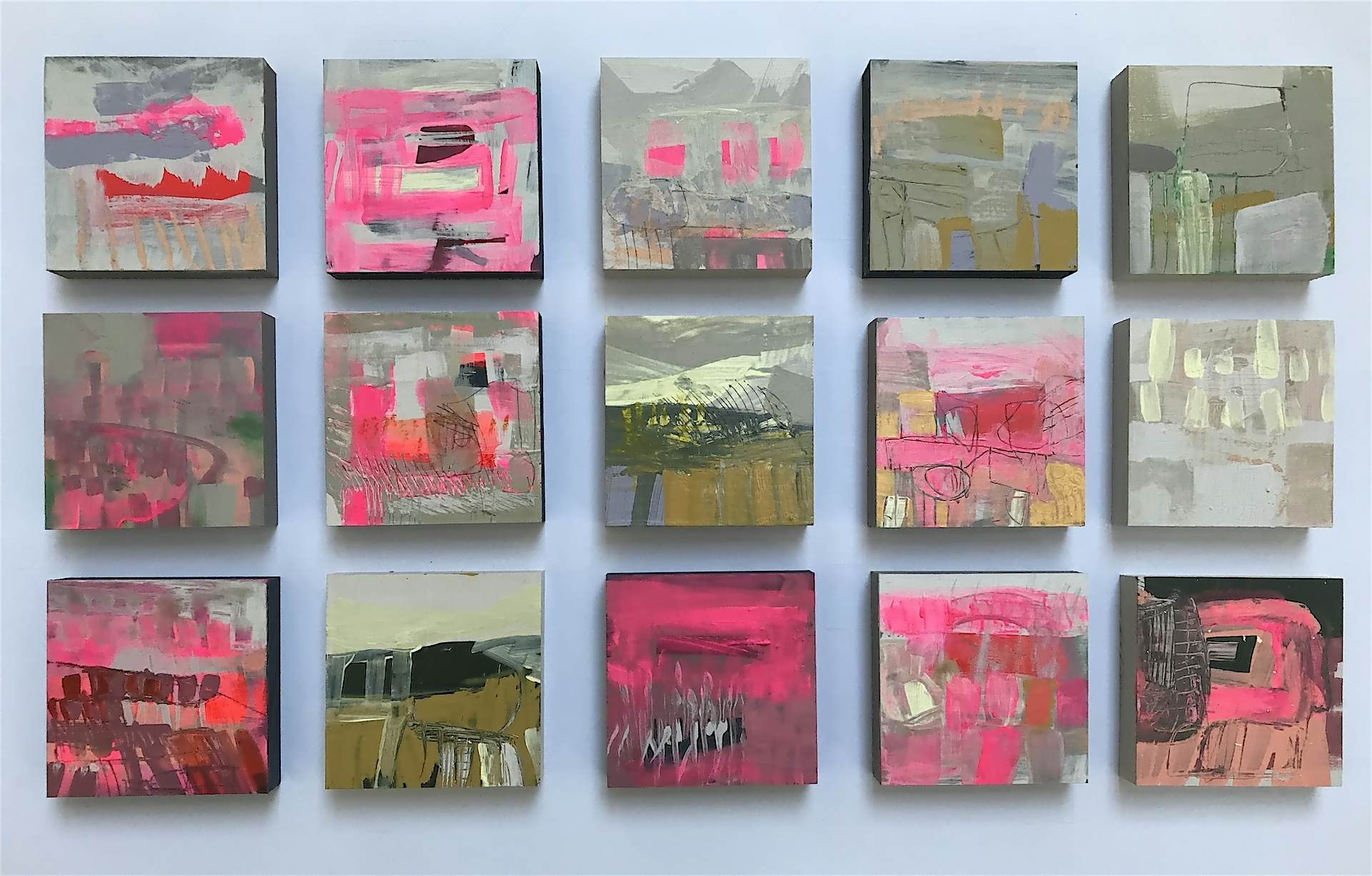
We catch up with Hastings-based abstract landscape painter, Louise Body
spotlight
We catch up with Hastings-based abstract landscape painter, Louise Body
Reading time: 4 mins
Join us as we catch up with Louise Body to discuss her upcoming limited editions with K&M, lunchtime sea swims and her career highlights to date.
 spotlight
King & McGaw sponsors the Turner Prize 2023 at Towner Eastbourne
spotlight
King & McGaw sponsors the Turner Prize 2023 at Towner Eastbourne
Reading time: 2 mins
We are very proud to sponsor the Turner Prize 2023 at Towner Eastbourne, as it is hosted there for the very first time.
 spotlight
Yevonde: Pioneer of colour
spotlight
Yevonde: Pioneer of colour
Reading time: 1 min
To celebrate the long awaited reopening of the National Portrait Gallery we take a closer look at the work produced by Yevonde, one of Britain's most prolific female photographers.
 spotlight
Meet painter and printmaker David Price
spotlight
Meet painter and printmaker David Price
Reading time: 4 mins
The Margate-based artist talks to curator Becca Pelly-Fry about his fascination with brash, colourful ‘non-art’, and the edition he’s made for our Curated Editions collection, New Mythologies.
 spotlight
L’Atelier Mourlot: Masters of twentieth-century lithography
spotlight
L’Atelier Mourlot: Masters of twentieth-century lithography
Reading time: 3 mins
Discover the rich history of l’Atelier Mourlot through the artists that worked with the studio.
 spotlight
Hilma af Klint and Piet Mondrian – Pioneers of abstraction
spotlight
Hilma af Klint and Piet Mondrian – Pioneers of abstraction
Reading time: 2 mins
To celebrate the opening of Tate Modern’s exhibition ‘Hilma af Klint and Piet Mondrian: Forms of Life’, we take a closer look at the two pioneering artists. We deduce the similarities between their artworks which eventually resulted in the creation of an alternate visual language known as abstraction.
 spotlight
Meet Dennis Nothdruft, Head of Exhibitions at Fashion and Textile Museum
spotlight
Meet Dennis Nothdruft, Head of Exhibitions at Fashion and Textile Museum
Reading time: 2 mins
To celebrate the opening of their latest exhibition, ‘Andy Warhol: the Textiles’, we speak to Fashion Textile Museum‘s Dennis Nothdruft about the importance of Warhol’s early illustrations
 spotlight
Ele Pack’s new beginnings and emotion-filled abstracts
spotlight
Ele Pack’s new beginnings and emotion-filled abstracts
Reading time: 4 mins
Upon the release of our latest collection with artist Ele pack, we caught up with her to discuss her recent relocation to Derbyshire, and the new direction of her work.
 spotlight
Meet abstract landscape painter Claire Oxley
spotlight
Meet abstract landscape painter Claire Oxley
Reading time: 2 mins
We sit down with her to to discuss her journey through music and colour
 spotlight
Meet Manchester light installation artist Liz West
spotlight
Meet Manchester light installation artist Liz West
Reading time: 5 mins
We caught up with the celebrated artist to discuss her fascinating artistic practice and the newly-available limited-edition prints of her imaginative sculptural drawings.
 spotlight
Meet Scottish artist Ron Lawson
spotlight
Meet Scottish artist Ron Lawson
Reading time: 3 mins
Learn about the inspiration behind his distinct monochrome landscapes and his new collection of prints.
 spotlight
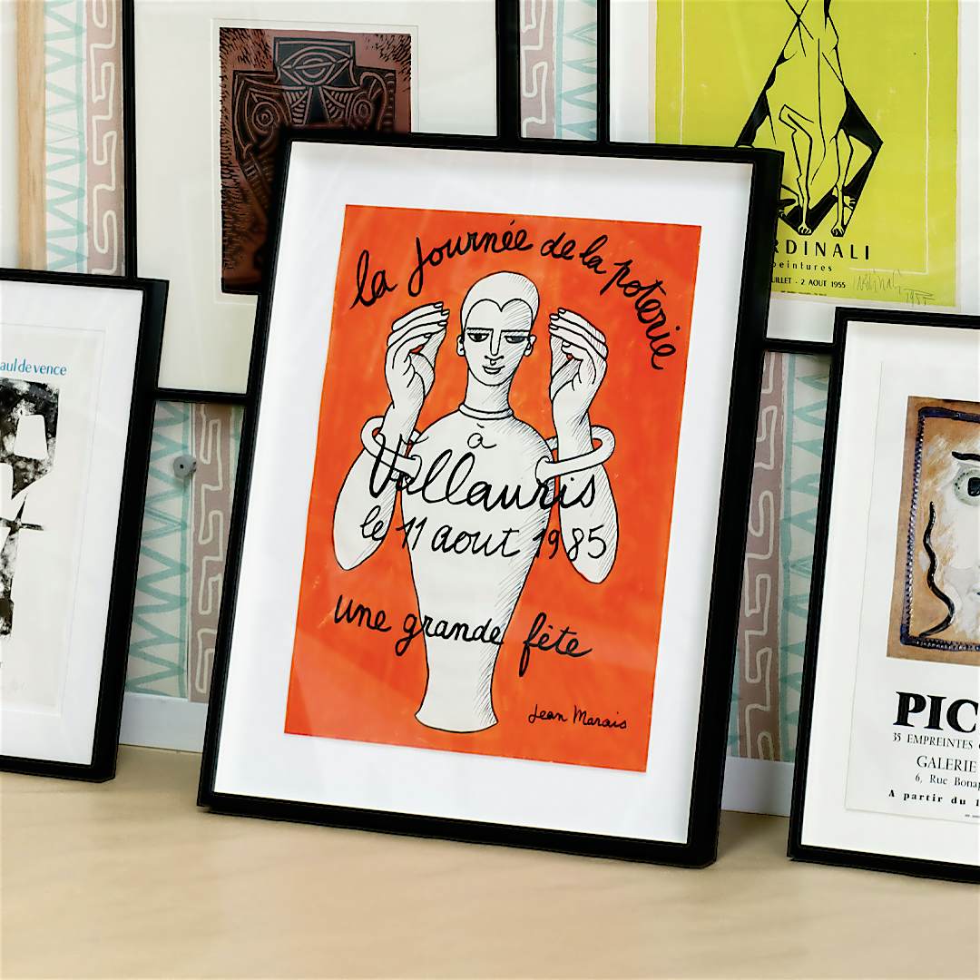
La journée de la poterie á Vallauris, 1985
spotlight
La journée de la poterie á Vallauris, 1985
Reading time: 1 min
Translated from French as, ‘A special day of pottery in Vallauris, 11th August 1985; a big party’, this incredibly rare poster was created by French actor and artist Jean Marais. We take a look at how the field of ceramics and his relationship with Jean Cocteau influenced his design.
 spotlight
Exhibitions to see this spring
spotlight
Exhibitions to see this spring
Reading time: 2 mins
Discover our top picks, brought to you by many of our long-standing museum and art gallery partners including the Tate, Royal Academy and The National Gallery.
 spotlight
Meet Willie Christie
spotlight
Meet Willie Christie
Reading time: 4 mins
We catch up with photographer Willie Christie to discuss his remarkable career and his limited edition prints.
 spotlight
The rare Visual Aid charity silkscreen designed by 104 leading British artists
spotlight
The rare Visual Aid charity silkscreen designed by 104 leading British artists
Reading time: 1 min
Join us as we delve deeper into the significance of the rare silkscreen print featuring original artwork tiles produced by rock stars of the British art world David Hockney, Frank Bowling, Howard Hodgkin, and Bridget Riley to name a few.