Soulful and witty: Projekt 26 and the Polish School of Posters
Suggested filters
With special access to Projekt 26 – an unrivalled collection of posters amassed by British/Polish expert art dealers Harriet and Sylwia – we examine the bold and witty poster designs that emerged from Communist Poland and went on to change the course of modern graphic design.
Sites of experimentation
After Poland’s catastrophic losses during the Second World War (some estimate that the country lost 20 percent of its population, and almost all cultural activities were banned) fences were erected around bomb sites. These make-shift sites ended up becoming experimental street galleries for poster designers to present their work.
Although citizens of the Polish People’s Republic were placed under strict Soviet rule and suffered great repression and hardship, posters remained one of the few artistic outlets permitted by the ruling Communist state.
Easily reproduced on transportable lithographic presses, posters became an effective propaganda tool used by Soviet rulers to promote the ‘feel-good’ work of the Ministry of Art and Culture.
As they were printed in strict runs and never designed to be kept, the Polish posters that survive today have been salvaged from the streets, cinemas, exhibitions, music festivals, ballet, theatres and circus performances where they were originally displayed.

Subtly subversive
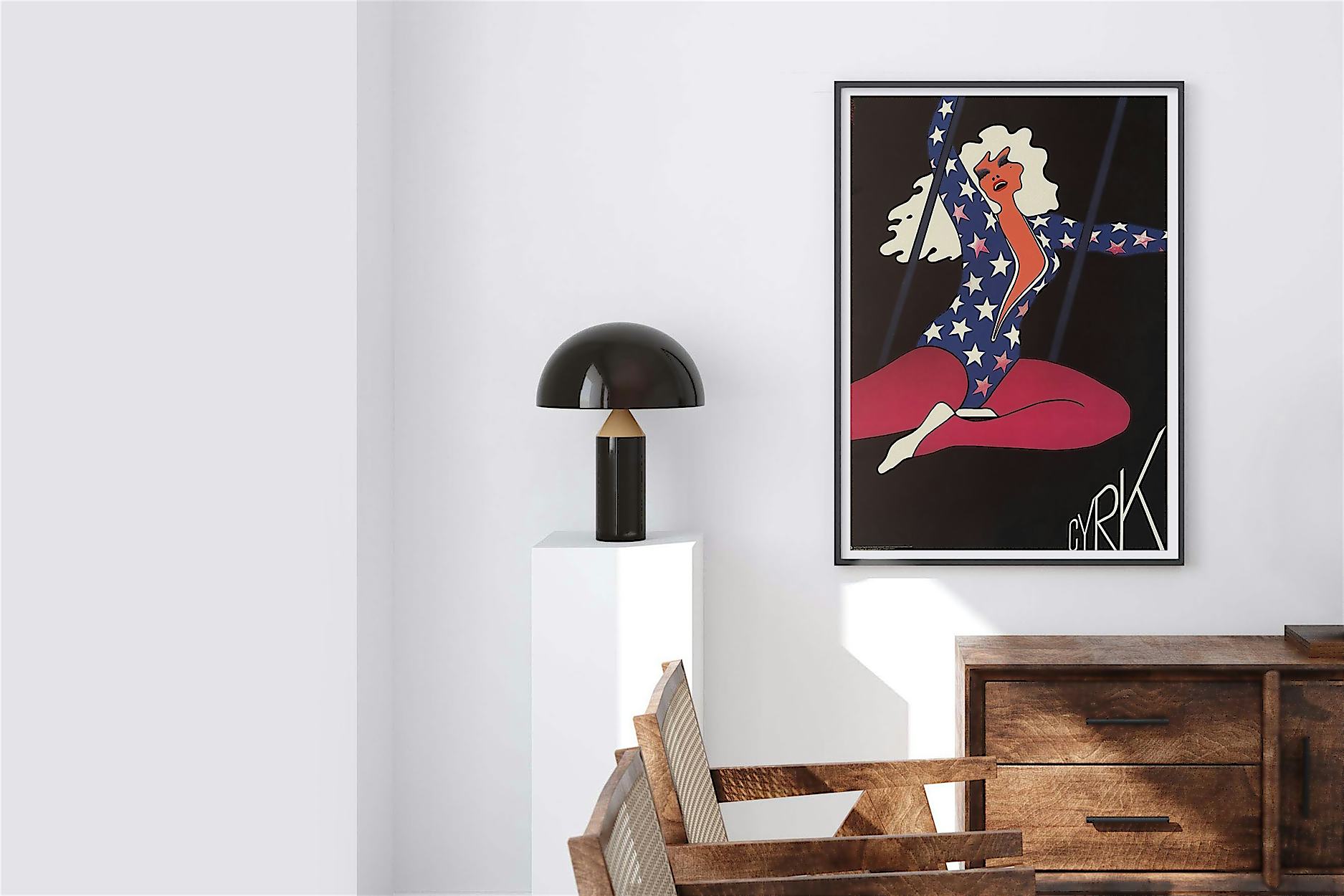
Over time, designers from the Polish School of Posters found ways to introduce subversive visual metaphors that subtly mocked Communist rule. Since the sixteenth-century, the Soviet Union had often been personified in political cartoons and engravings as a ferocious bear.
Waldemar Świerzy, who started designing posters at the tender age of 15 and went on to become one of the most prolific designers of his generation, created Circus Tuxedo Bear in 1974 (below).
Świerzy’s circus bear (CYRK, is Polish for circus) ridicules the pompousness of the Soviet bear by dressing it in a black and white tuxedo, provocatively positioned next to a tiny, and ironically unrideable, bicycle.
Importantly, though the metaphor is acrimonious, no direct statement is made. Instead, the poster is a shrewd work of political symbolism that cleverly escapes censorship.
In Świerzy’s view, as an art form, a poster ‘must provoke the viewer to look. It must focus their attention, if only for a few moments.’ In so doing, such designs elevated posters from simple advertising tools, which were designed to catch the attention of passers-by, into truly original and thoughtful works of art that were designed to be ‘read’.

Minimalist masters
Designers from the Polish School of Posters were responsible for creating wonderfully minimalist designs that encouraged viewers to participate actively in the reception of a strong visual message.
With its straightforward contours and dramatic monochrome execution, Mieczysław Wasilewski’s poster design for Emile Ardolino’s 1987 film Dirty Dancing (below) is a brilliant example of condensed and unambiguous design.
Given the nature of the centrally-planned economy, it was inevitable that posters would become more of a visual than an advertising vehicle, elevated not in terms of sales but in terms of design.
Stripping a design down to only the bare essentials – including the title and the names of the cast playfully running down the right leg, Wasilewski creates a beautifully succinct composition that has immediate and long lasting impact.
A believer in the maxim that ‘less is more’, the key to his success, and the secret behind Wasilewski’s technique was, in his own words, the rejection of all ‘bad things that come up on the way.’

Throwing out the rule book
Unlike many western designers who followed conventional layouts and visual hierarchies by separating type and graphics, designers from the Polish School of Posters often integrated them into the figures and forms they depicted. Since fonts were not available, they often drew letters by hand, making their designs truly unique.
Warm and inviting, Jan Młodożeniec’s style is characterised by rich colour fields and painterly lines. For his design Mystic Pizza which advertised the 1990 Polish cinema release of the 1980s film starring Julia Roberts and Matt Damon, he gives the figure’s long wavy hair form by adorning it with painterly lettering: ‘amerykańska komedia romantyczna’ [American romantic comedy], alongside the names of notable cast members.

Mucha Ihnatowicz, one of the female designers in a profession dominated by men, created posters with similarly idiosyncratic lettering. Unlike western advertisements, Polish posters were not expected to provide detailed information such as dates, times and locations which were posted elsewhere. The information transmitted was essentially visual.
Varying in size and colour, the hand-painted words ‘niedziela wnowym jorku’ [which translates to Sunday in New York], stretch across Ihnatowicz’s 1967 design advertising the release of the American film.
It starred Jane Fonda and followed the mad-cap escapades of a cooky heroine who deliberates upon the virtues of premarital sex. Ihnatowicz makes subtle reference to the film’s sensual themes by placing two figures in profile divided by a sinfully-suggestive half-bitten apple.

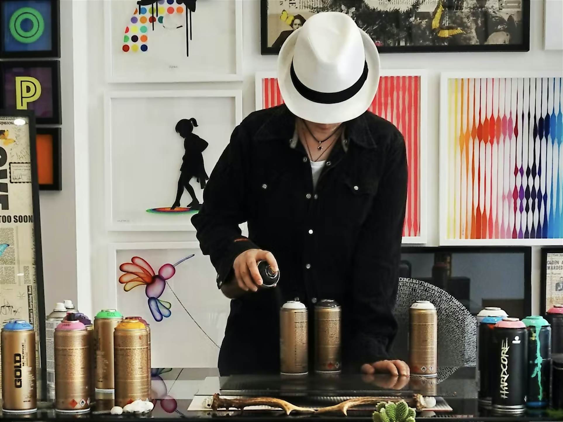
Though many won international awards and are held in major art museums around the world today, most Polish poster designers remain woefully overlooked. Working with Polish Poster specialists Harriet and Sylwia who have created Projekt 26, we’re honoured to introduce a fantastic collection of these posters as limited edition prints.
The duo, who share a passion for preserving graphic design and the innovative work that emerged from postwar Poland, are valiantly challenging preconceptions about Eastern European art and design.
Related stories
 spotlight
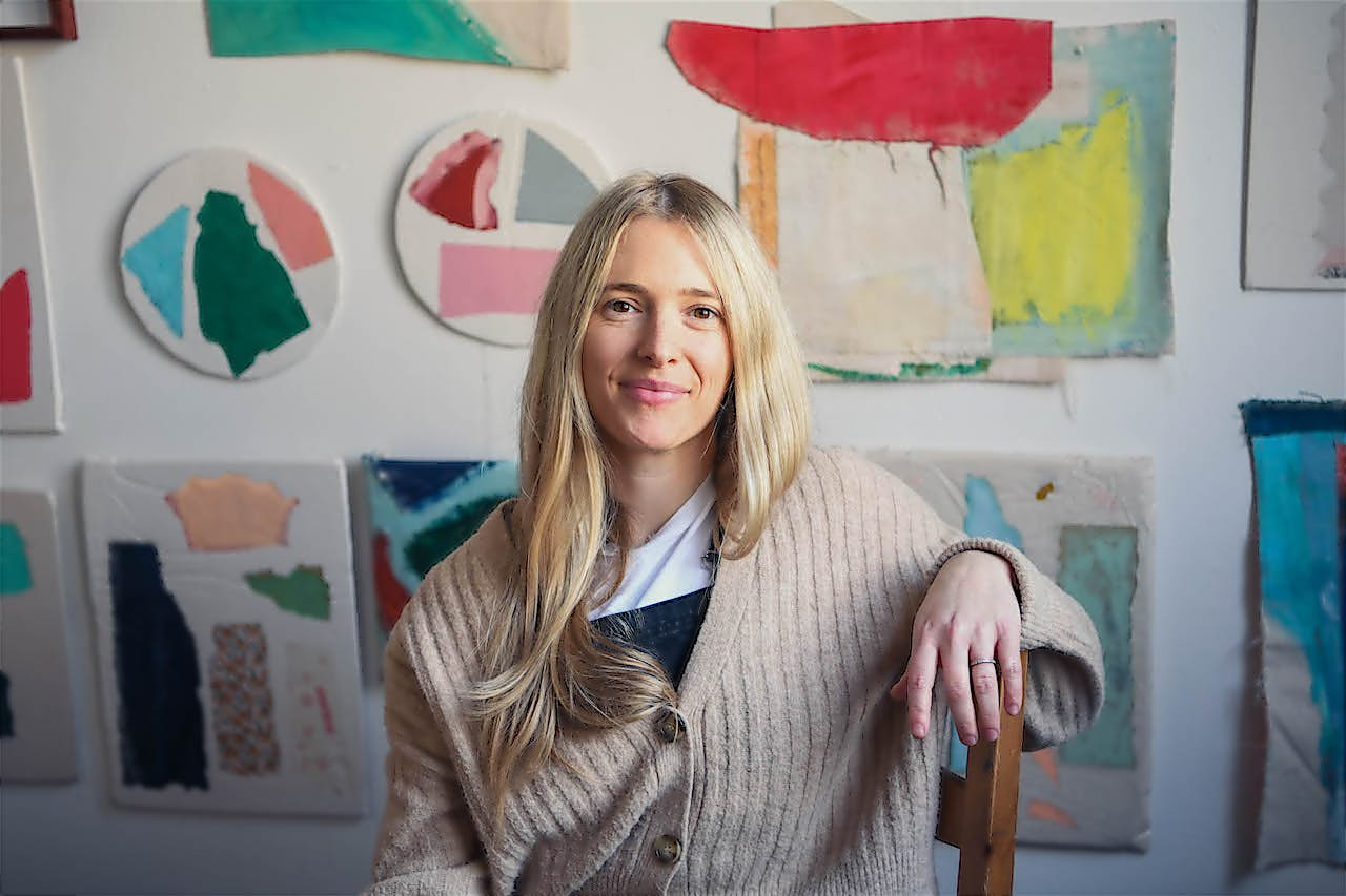
Ele Pack’s new beginnings and emotion-filled abstracts
spotlight
Ele Pack’s new beginnings and emotion-filled abstracts
Upon the release of our latest collection with artist Ele pack, we caught up with her to discuss her recent relocation to Derbyshire, and the new direction of her work.
Suggested filters
 spotlight
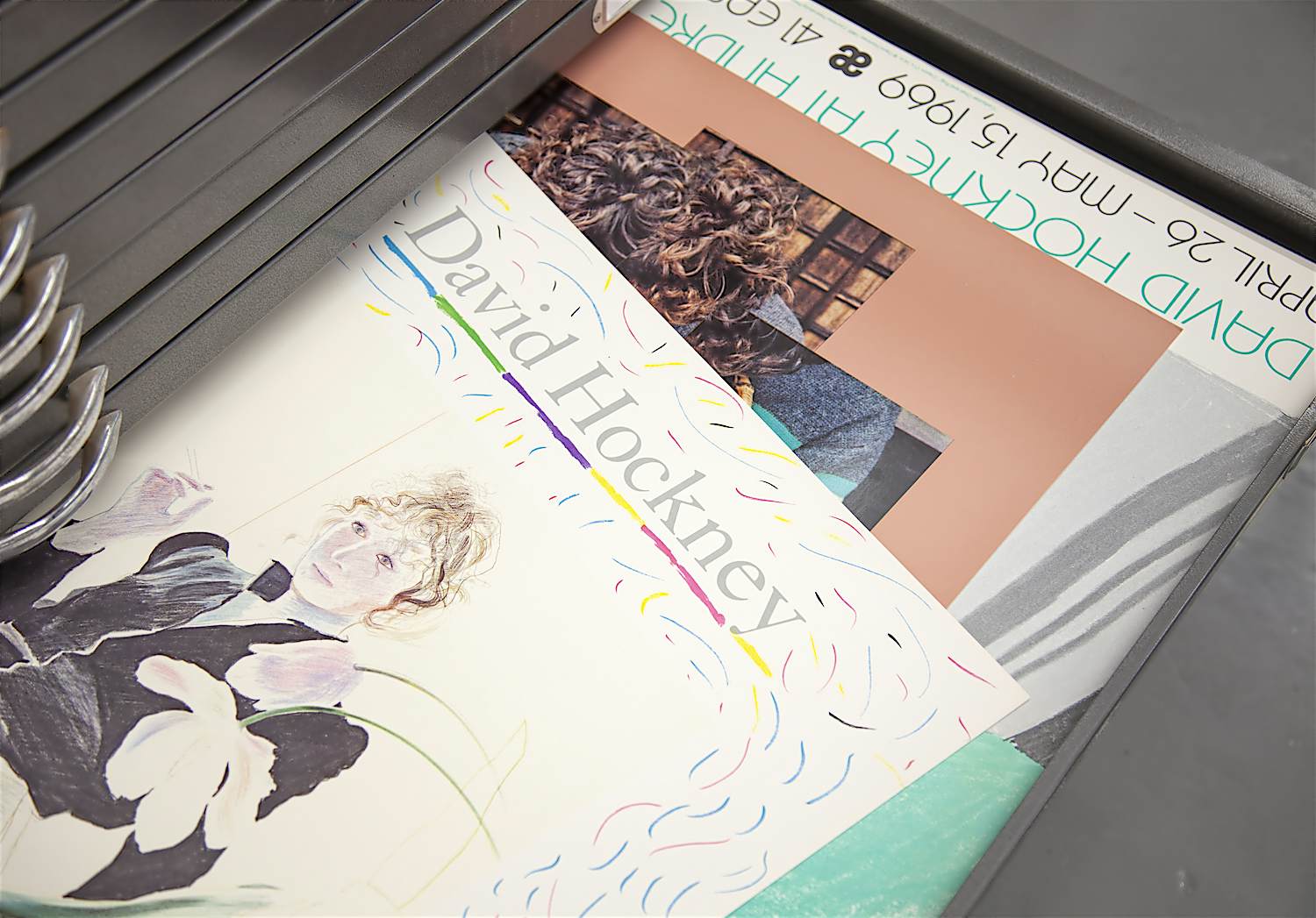
David Hockney’s collectible exhibition posters
spotlight
David Hockney’s collectible exhibition posters
Discover the collectible exhibition posters Hockney designed for Tate, Louisiana Museum of Modern Art, San Francisco Opera and more.
Suggested filters
 spotlight
Meet London-based design studio Oscar Francis
spotlight
Meet London-based design studio Oscar Francis
Join us as we talk to Sarah Evans, the architect turned artist behind London-based design studio Oscar Francis about her work, inspirations and her experience of life as an artist during lockdown.
Suggested filters
 spotlight
Brighton-based mixed-media artist VeeBee’s technicolour works
spotlight
Brighton-based mixed-media artist VeeBee’s technicolour works
Learn more about her unusual nocturnal art practice, her beloved cat ‘NooNoo’, and the vibrant portraits she creates of Marilyn Monroe, Audrey Hepburn and more.
Suggested filters
 spotlight
Rosco Brittin’s impossibly intricate floral collages
spotlight
Rosco Brittin’s impossibly intricate floral collages
Based in London, quirky collage artist Rosco Brittin tells us about his animal muses and an intriguing 'spirit genie' that offers him creative fuel...
Suggested filters
 spotlight
Meet Hastings-based abstract landscape painter Louise
spotlight
Meet Hastings-based abstract landscape painter Louise
Join us as we catch up with Hastings-based abstract landscape painter Louise Body to discuss fisherman’s smocks, juggling work and home life, and her previous career as a wallpaper designer.
Suggested filters
 spotlight
Meet London-based collage artist Scarlett Bowman
spotlight
Meet London-based collage artist Scarlett Bowman
Scraps of fabric found at markets, toxic colours, and traffic cones – these are just some of the things that influence London-based collage artist Scarlett Bowman.
Suggested filters
 spotlight
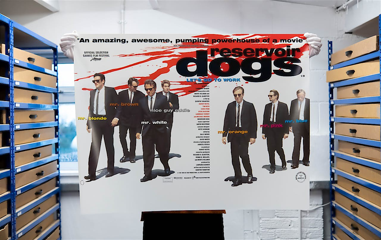
Rare Film Posters: Hollywood giants and iconic actors
spotlight
Rare Film Posters: Hollywood giants and iconic actors
Join us as we take a closer look at some of the world’s best-loved blockbusters that feature in our Rare Film Poster archive.
Suggested filters
 spotlight
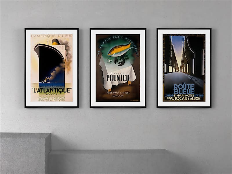
Art Deco travel posters by A.M. Cassandre
spotlight
Art Deco travel posters by A.M. Cassandre
A.M. Cassandre’s early work afforded him instant acclaim. We delve deeper into the journey he took to become one of the most sought-after commercial illustrators of his generation, creating works such as Normandie, Nord Express, and many more influential graphic design posters.
Suggested filters
 spotlight
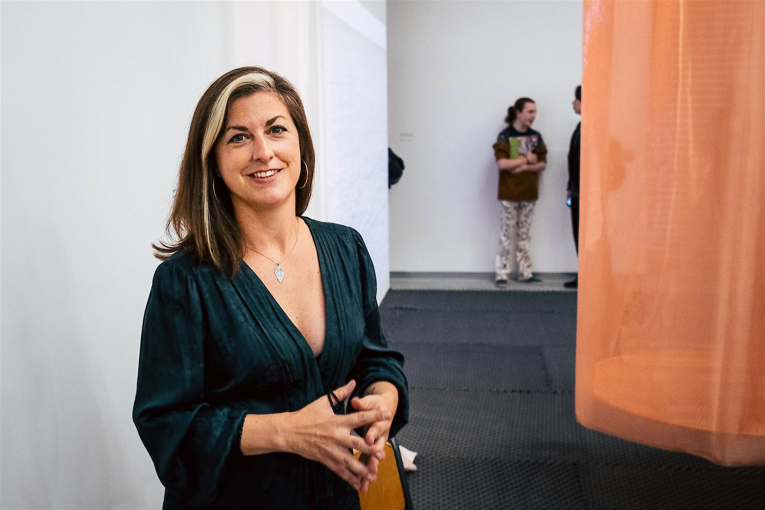
Curated Editions: Meet curator Becca Pelly-Fry
spotlight
Curated Editions: Meet curator Becca Pelly-Fry
We catch up with London-based curator Becca Pelly-Fry to discuss how the soon-to-be-launched Curated Editions collection ‘New Mythologies’ is taking shape, which artists to look out for, and how to receive information about the limited edition artworks.
Suggested filters
 spotlight
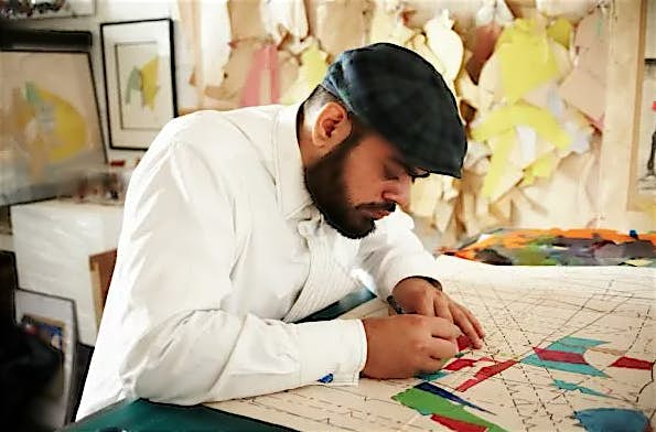
Introducing London artist Hormazd Narielwalla
spotlight
Introducing London artist Hormazd Narielwalla
Hormazd Narielwalla’s unique artistic process starts with antique tailoring patterns as the base – collected from a variety of sources, from Savile Row tailors to vintage domestic tailoring patterns.
Suggested filters
 spotlight
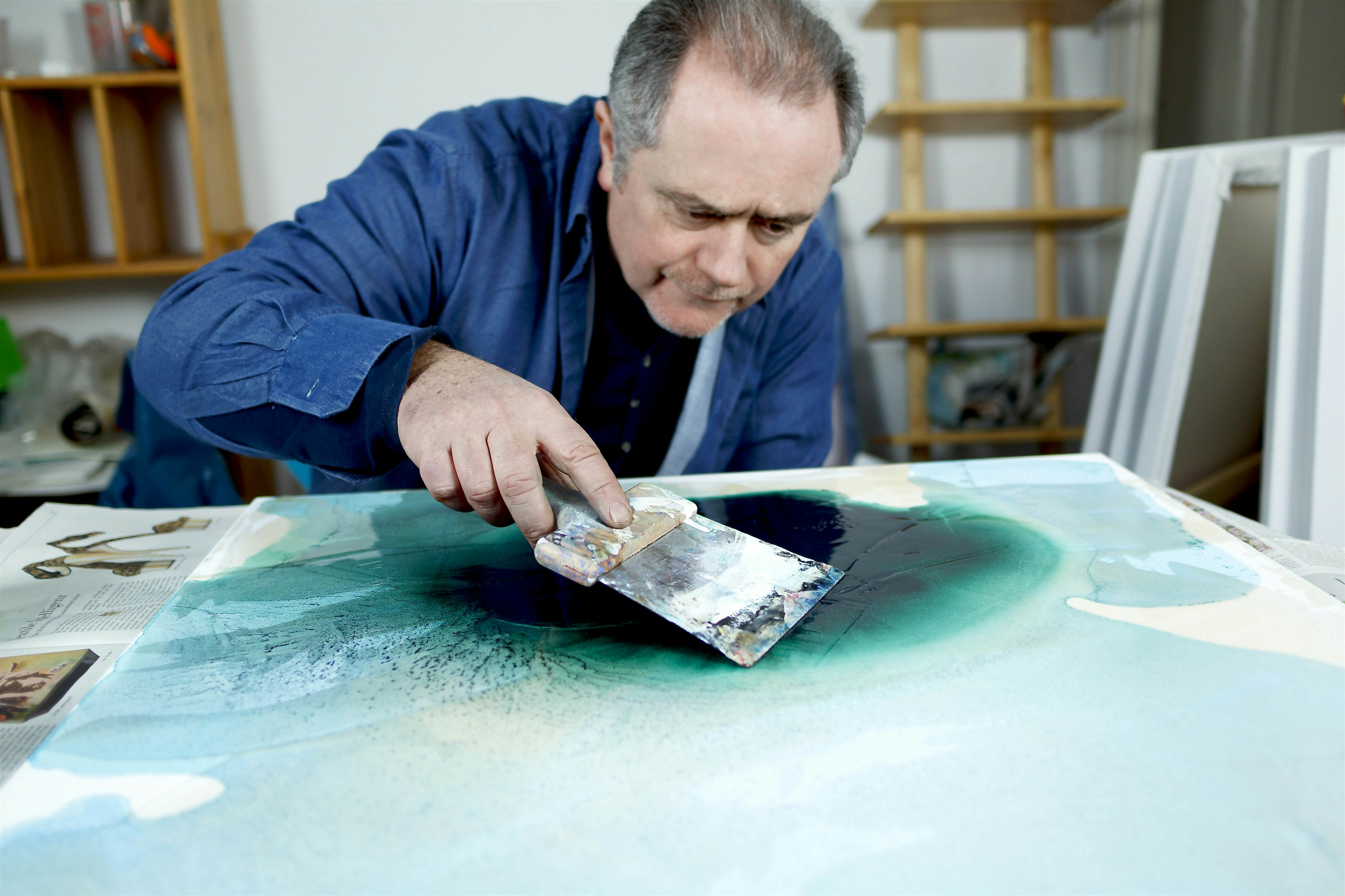
In the studio with Fintan Whelan
spotlight
In the studio with Fintan Whelan
Irish artist Fintan Whelan tells us about his painting technique which is achieved by pouring, tilting and scraping materials, layer upon layer.
Suggested filters
 spotlight
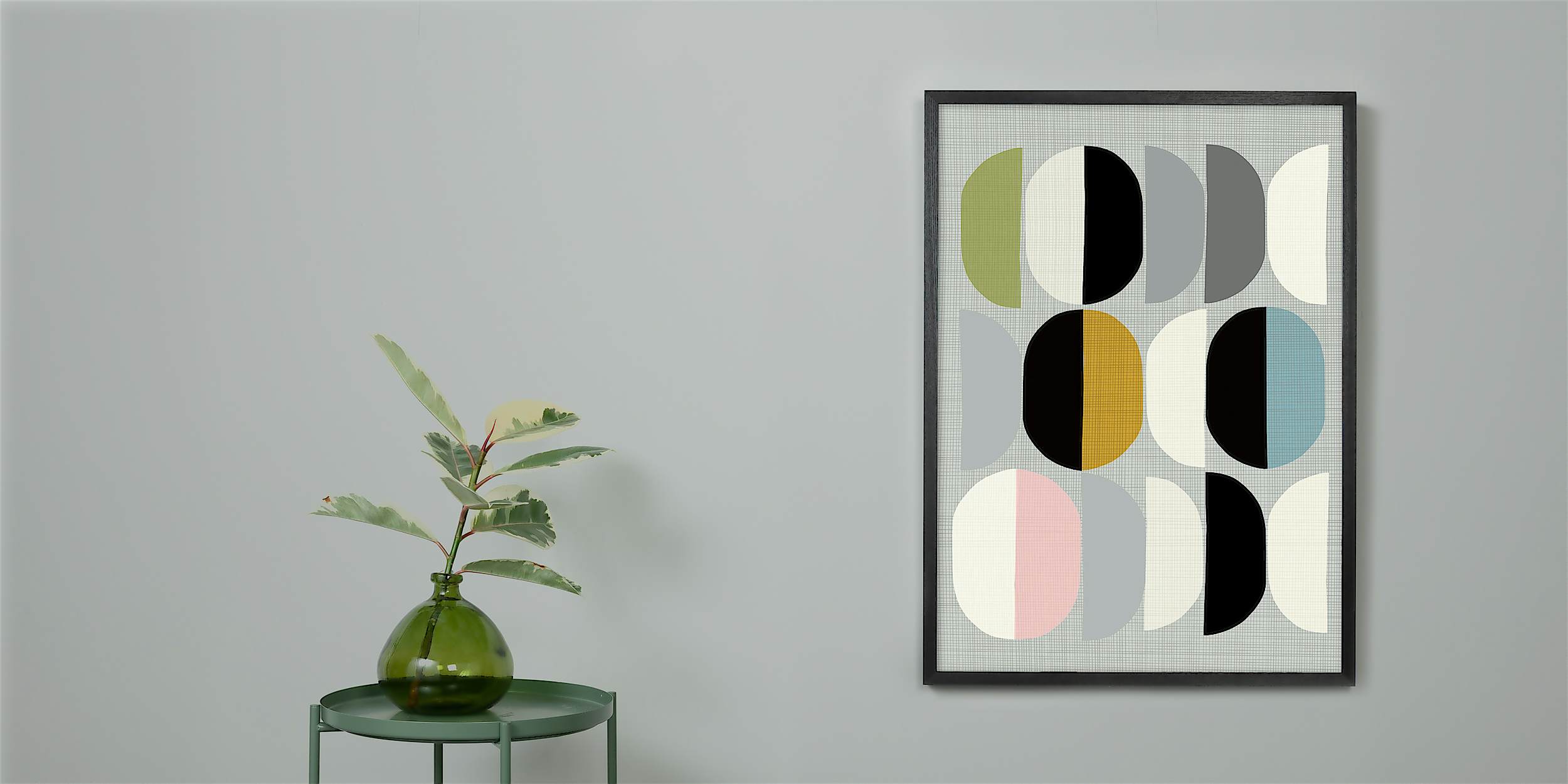
Meet Sheffield designer and illustrator Michelle Collins
spotlight
Meet Sheffield designer and illustrator Michelle Collins
Taking inspiration from buildings, their shapes and the negative spaces they create, Sheffield designer and illustrator Michelle Collins creates smooth geometric artworks.
Suggested filters
 spotlight
Meet celebrated Australian creative art studio, Inaluxe
spotlight
Meet celebrated Australian creative art studio, Inaluxe
We interview dynamic design duo Kristina Sostarko and Jason Odd. Responsible for creating Inaluxe, the pair talk to us about their synchronised creative collaborations and they love of bright colours, shapes and forms.
Suggested filters
 spotlight
Israeli artist Yoni Alter’s colourful graphic designs
spotlight
Israeli artist Yoni Alter’s colourful graphic designs
Israeli artist Yoni Alter now lives and works by London’s winding canals. He chats to us about his love of experimentation, his love of minimalism, and his innate compulsion to keep on creating.
Suggested filters
Subscribe to our newsletter
Be the first to hear about our new collections, limited edition launches, and enjoy artist interviews.
By subscribing you agree to our privacy policy.
Contact us: customer care
Email us
01273 511 942
Mon-Thurs, 9 am - 5 pm
Fri 9 am - 2 pm
All art prints and images on this website are copyright protected and belong to their respective owners. All rights reserved.