Curated Editions: Meet painter Dee Ferris
Reading time: 3 mins
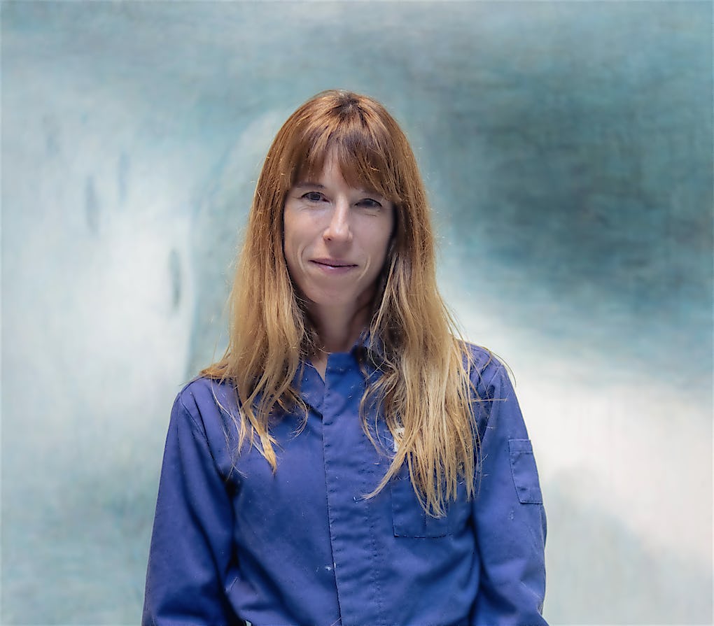
Dee Ferris is a painter based in Brighton. Her work, which is often large in scale and created through the physicality of her body, depicts dreamlike scenes, as if seen through a colourful fog. She is one of 11 contemporary artists whose work features in our Curated Editions collection, New Mythologies. In this interview with curator Becca Pelly-Fry, she discusses pushing against the serenity of idealised travel images found in books and glossy magazines.
Q: Can you tell us a bit about your initial processes: how do you begin a piece, what are your main influences?
A: I tend to start from very concrete images that I find in travel websites and magazines. They’re always these very ‘ideal’ images. I’m drawn to them because they’re so gorgeous. But, over time, they erode. They disintegrate. I like to think of it as an un-doing of the image. It’s not always a conscious thing. It tends to evolve naturally. There’s always a question of how much the original image should disappear and disintegrate, and that’s something I find quite interesting.
Q: So, would you say the process is multi-layered?
A: Yeah, in a way, I could keep on going forever. I sometimes wonder if, at some point, it’d be nice to document the evolving process as it’s such an integral part of my work.

Q: What artworks are you working on at the moment?
A: I’m working on six paintings at the moment. My work deals with lots of different genres but it might loosely be labelled landscape painting that deals with the sublime. Themes of the sublime speak to a slightly unsettled experience about travel which became more interesting over the pandemic when we couldn’t move around as freely.
When such idealistic images persist around us, feelings of needing to be somewhere else often creep in. That feeling has definitely influenced my current series which is informed by a pair of contradictory words that have been floating around in my head lately. The word is ‘Azul’, which is blue and links to the tropical Mediterranean azure (a colour between cyan and blue on the spectrum of visible light which is often described as the colour of the sky on a clear day). But it can be spelt another way: ‘ASYL’, which is asylum.
‘I don’t see myself as an artist. It’s just painting for me. It’s a way of dealing with life. In the same way swimming in freezing cold water at the crack of dawn is, or dancing.’
Dee Ferris

Q: You reference water a lot in your work, can you tell us a bit more about the reasoning behind that?
A: There are various forms of water in my work. I have friends that I swim with who are also artists and they do drawings and collages and make stuff that’s very directly related to swimming. But, for me, I think it informs my work in a much more ambiguous way. And I think it’s strange because, in some ways, I don’t see myself as an artist. It’s just painting for me. It’s a way of dealing with life. In the same way swimming in freezing cold water at the crack of dawn is, or dancing. Painting is a way for me to make sense of living in the world.
Q: You’ve recently started dancing as well, haven’t you? Does that influence your paintings too?
A: That's a really interesting question. I know artists who do merge the two and that’s not something I’ve explored yet. I like the idea that it will inform future work. I work on such large scale paintings that in a way there is a sense of movement within them already, but I’m not sure where it’s going to go at this point. As you say, dance is still relatively new for me and I hope that as I do more of both painting and dance, I’ll achieve a greater sense of freedom that might show itself in my work.

Q: Do you think it’s necessary to travel far to find inspiration?
A: People often suggest that maybe I’d like to paint things closer to home. Or, since I live near the sea, I swim a lot, and I experience amazing sunsets and sunrises every day that I could be influenced by. But that’s not what it’s about. For me, it’s the idea that comes first. Always. So it is the idea of being somewhere else and the idea of traveI. It’s almost like I have no say. Like the paintings have their own dynamic and I sort of have to follow that dynamic. It’s like I’m fighting with the painting all the time. I’m never completely sure where it’s going to go.
Q: Can you tell us a bit about why you’re interested in producing limited prints of your work with King & McGaw?
A: Printmaking is so interesting for me because it’s such a different process. Having to stop at a certain point where the image is still so ‘there’ in my mind is quite wonderful. It’s really liberating. The edition I’m making with King & McGaw is called Farewell Song (Spring Water Dripping).
It is based on a stock travel image of Beaver Falls on the Havasupai Indian Reservation in Arizona. It reflects my ongoing interest in the power of advertising as well as engaging with the long tradition of Romantic landscape painting. As with much of my work, it aims to provide a critique of the aspirational tropes deployed by the travel media, taking the devices and false narratives employed within the world of consumer seduction and re-staging them as unstable and unconvincing visions.
The title of this work refers to a Havasupai love song which, in contrast to its re presentation as an idyllic holiday destination, speaks directly to the land as a living (sentient) being, and explores the erosion of the youthful fantasy of immortality.
Making prints is very, very new to me and I find it really exciting because it’s such a different way of working and decision making. My editions for King & McGaw include hand finishing which is really lovely because it enables me to bring a bit of myself back into the artwork but in a very considered way. It’s amazing to see all these tiny lines and how they transform each of the prints in their own unique way.
Related stories
 spotlight
Meet Inga Fraser, Senior Curator at Kettle’s Yard
spotlight
Meet Inga Fraser, Senior Curator at Kettle’s Yard
Reading time: 7 mins
We sit down with Inga Fraser, who tells us about her favourite artwork in the collection, balancing conservation measures alongside research and public engagement programmes, as well as plans to mark the gallery’s 70th anniversary in 2027.
 spotlight
A year in publishing 2025: our curatorial team’s highlights
spotlight
A year in publishing 2025: our curatorial team’s highlights
Reading time: 3 mins
We sat down with our curatorial team to reflect on the standout moments in publishing from 2025.
 spotlight
Exhibitions to see this winter with a National Art Pass
spotlight
Exhibitions to see this winter with a National Art Pass
Reading time: 2 mins
Discover the top exhibitions of the winter, brought to you by our friends at Art Fund
 spotlight
Inside Hodgkin’s Studio
spotlight
Inside Hodgkin’s Studio
Reading time: 1 min
A photographic roundup of our exclusive Open Studio event to mark 40 years since the seminal 1985 exhibition Howard Hodgkin: prints 1977 to 1983 at Tate Britain.
 spotlight
We catch up with Blue Farrier
spotlight
We catch up with Blue Farrier
Reading time: 2 mins
We catch up with Blue to find out about the exciting things she has been up to since we last spoke, as well as to discuss her latest K&M release, and her intuitive style.
 spotlight
Meet Tabby Booth
spotlight
Meet Tabby Booth
Reading time: 3 mins
We talk to Tabby about her practice, including her passion for interiors, folk and outsider art. Plus her alternative art gallery, Sailors Jail, which can be found in the historic, picturesque streets of Falmouth.
 spotlight
Exhibitions to see this autumn
spotlight
Exhibitions to see this autumn
Reading time: 3 mins
Discover the exciting exhibitions opening this autumn at The Royal Academy of Arts, National Portrait Gallery, Tate Modern and many more.
 spotlight
Our Spectral Vision: Liz West’s latest installation
spotlight
Our Spectral Vision: Liz West’s latest installation
Reading time: 1 min
Liz’s latest work, ‘Our Spectral Vision’, is now on display at York Art Gallery, forming part of the exhibition, Future Tense: Art in the Age of Transformation, which runs alongside the Aesthetica Art Prize 2025.
 spotlight
Meet Bianca Harrington
spotlight
Meet Bianca Harrington
Reading time: 4 mins
Join us in conversation with Bianca as she reflects on her journey through textiles and millinery, her ability to find awe in the everyday, and her plans for the future.
 spotlight
Meet graphic artist Nick Cranston
spotlight
Meet graphic artist Nick Cranston
Reading time: 2 mins
Join us as we talk to Nick about his artistic practice and his collection of graphic prints, available exclusively with K&M.
 spotlight
Works in series
spotlight
Works in series
Reading time: 1 min
Transform your walls with a curatorial touch. Our Works in series collection brings together compelling, cohesive artwork sets – each handpicked by our in-house experts for their narrative strength.
 spotlight
Our team’s favourite artworks
spotlight
Our team’s favourite artworks
Reading time: 2 mins
Each month we ask a member of the K&M team to share their favourite artwork and the reasons why they love it so much. Here’s our latest roundup.
 spotlight
Exhibitions to see this summer
spotlight
Exhibitions to see this summer
Reading time: 3 mins
Discover the exciting exhibitions opening this summer at The Courtauld, National Portrait Gallery, Tate Modern and many more.
 spotlight
Meet Artist Residence Founder, Charlotte Salisbury
spotlight
Meet Artist Residence Founder, Charlotte Salisbury
Reading time: 3 mins
To mark our partnership this Summer, join us in conversation with Charlotte Salisbury - Founder of the Artist Residence boutique hotel group - as she shares her unique approach to interior design, the story behind collecting artwork for each of her hotels, and the rich history that inspired the name Artist Residence.
 spotlight
We catch up with Yoni Alter
spotlight
We catch up with Yoni Alter
Reading time: 3 mins
We catch up with Yoni to to discuss his broad, experimental, playful oeuvre that ranges from spray paint and printmaking to small scale sculpture and large scale public art.